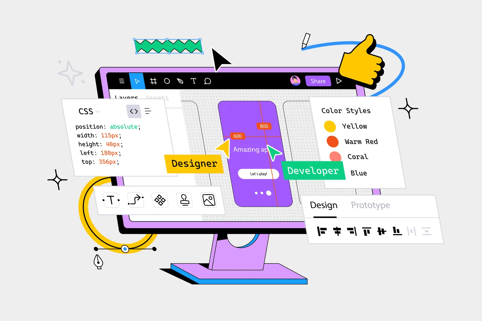
Design System

We design interfaces and experiences that feel inevitable—where the user's next step is always clear, the aesthetic is always considered, and the product feels premium without being precious.
Interfaces designed for clarity.
Design System
App UX Flow
Website Prototype
Component Library
Usability Testing
UI Design Reel
Clip 7
Clip 8
Clip 9
End-to-end capabilities built around your objectives.
We conduct user interviews, review analytics behaviour data, and run usability sessions on existing products to build an evidence base for design decisions—not a design based on assumptions.
Low-fidelity wireframes map information architecture and user flows; interactive prototypes in Figma test the logic and navigation of the experience before visual design is layered on.
Component-based design systems are built in Figma with consistent tokens for colour, typography, spacing, and interaction states—structured to hand off to development cleanly and scale without degradation.
High-fidelity interactive prototypes are used in usability testing sessions with representative users—capturing friction points and refining the design before developer handoff.
From brief to execution — every phase accounted for.
01
Stakeholder interviews, analytics review, user research sessions, and competitive interface analysis produce a research synthesis that informs all design decisions.
02
Site maps, user flow diagrams, and low-fidelity wireframes are produced to establish structure and navigation before any visual design begins.
03
A high-fidelity visual design system is built—covering all interface components in light and dark modes, responsive breakpoints, and interaction states—ready for prototyping.
04
An interactive Figma prototype is built and tested with real users. Findings are iterated and a final design is approved before developer handoff.
05
Design files are handed off with annotated specifications, asset exports, and a design-development sync session. We remain available during development to answer implementation questions.
What clients typically ask before we begin.
We design websites, mobile apps, web applications, event guest portals, admin dashboards, and digital touchpoints for brand and hospitality experiences. Most of our UI/UX work connects to an event or brand experience brief.
Yes. Figma is our primary design and prototyping environment. All files are delivered in a structured Figma workspace with organised pages, component libraries, and developer-ready auto-layout components.
Yes. Interface redesigns without full rebuilds are a common brief. We audit the existing interface for usability and visual quality issues, then produce a redesigned component system that can be applied incrementally by the development team.
Yes. User testing is offered as a formal component of the UI/UX design process—either moderated sessions with recruited participants or unmoderated remote testing. We define test scenarios, conduct sessions, and deliver a findings report with design implications.
We design to WCAG 2.1 AA standards as a baseline—covering colour contrast ratios, focus states, touch target sizing, screen reader compatibility in design annotations, and keyboard navigation in interactive prototypes.
Share your requirements below. We respond within one business day.
Prefer email? Write to contact@craftoire.com